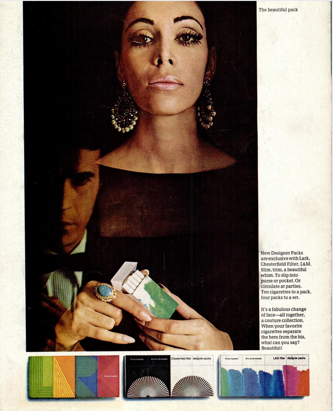
Mystery Illustration 34

This wordless packaging was designed in 1968 to hold a very common consumer item. What was inside?
The answer is here.
And after the jump.

Comments
So, not a Slinky.
Posted by TheCannyScot on 12/05/16 at 07:33 AM
Ye gods, that makeup is frightening!
Posted by Claude3rd on 12/05/16 at 09:26 AM
My guess was a bar of soap. She could use one.
I'm wondering if they got the Lark motif from the dude's shirt or he just got cute for the ad.
I'm wondering if they got the Lark motif from the dude's shirt or he just got cute for the ad.
Posted by Virtual on 12/05/16 at 10:25 AM
Commenting is not available in this channel entry.

Category: Design and Designers | Graphics | Products | 1960s